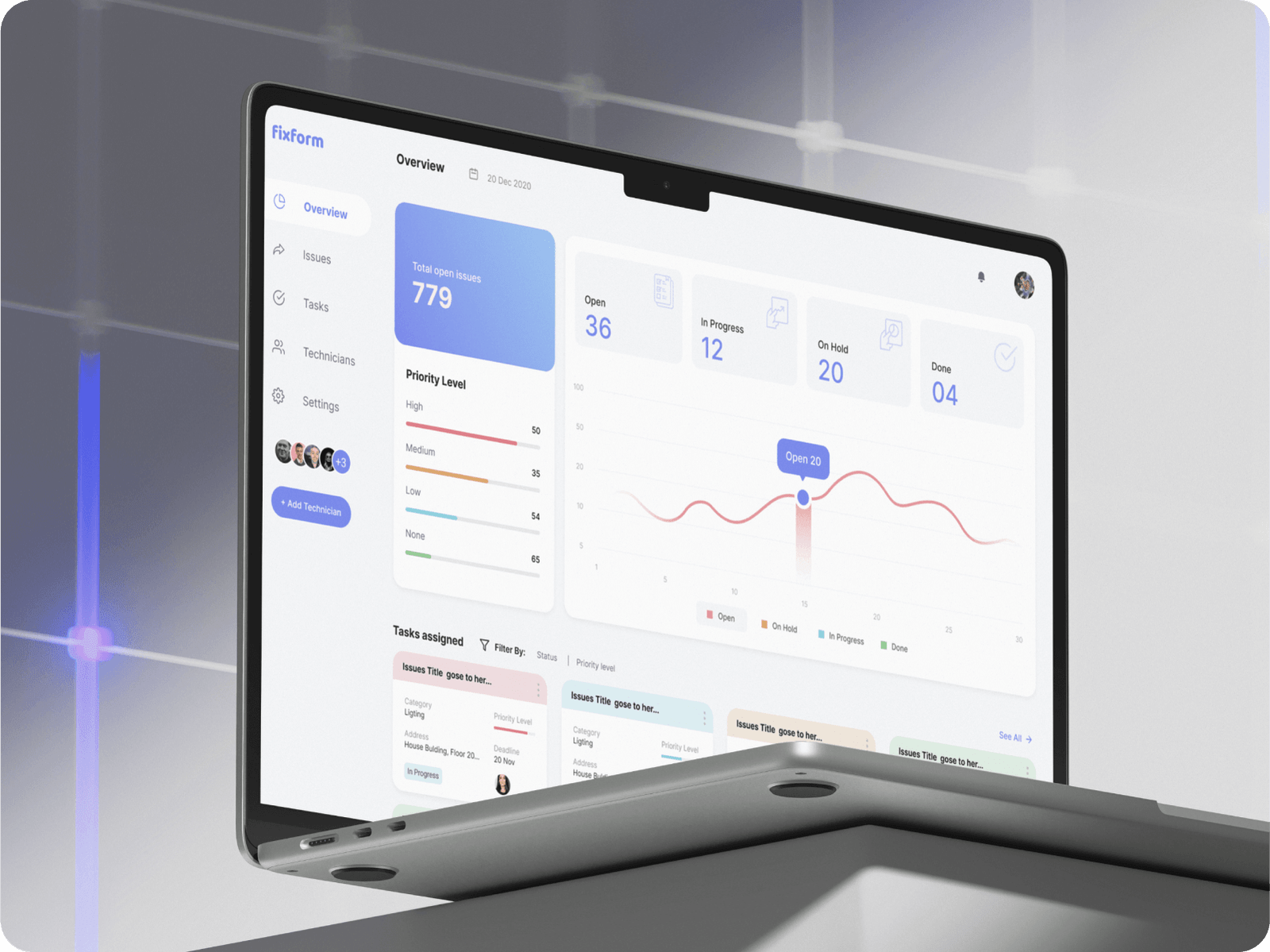
Imagine this. You’re trying out a new SaaS tool that promises to make your workflow easier. You sign up, ready to dive in, and then… confusion. You’re greeted with a blank dashboard. No hints. No instructions. Just buttons you don’t quite understand. You poke around a bit, maybe click here and there, but it feels like you’re lost in a maze. A few minutes later, you close the tab. The product didn’t feel right, so you move on.
That’s the reality for too many first-time users.
Onboarding is the make-or-break moment in any SaaS experience. If it feels smooth, logical, and helpful, users stick around. If it feels frustrating, slow, or overwhelming, they leave. It’s that simple.
So how do you make onboarding feel effortless? How do you design an experience that makes users feel like they’re making progress from the first click? That’s what we’ll cover in this article. I’ll walk you through key UX patterns that help create a frictionless onboarding experience, share practical examples, and give you ideas you can use today.
Let’s get started.
Why Frictionless Onboarding Matters
First impressions matter. You don’t get a second chance at that initial experience. When a user signs up for your product, they’re excited. They’re hopeful. But they’re also cautious. If your onboarding process makes them work too hard, they’ll lose interest fast.
Friction shows up in different ways:
- Long, unnecessary forms that ask for too much upfront
- Confusing layouts or unclear navigation
- Lack of guidance on what to do next
- Too much information at once
- No support or resources available at the right time


