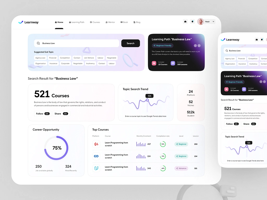
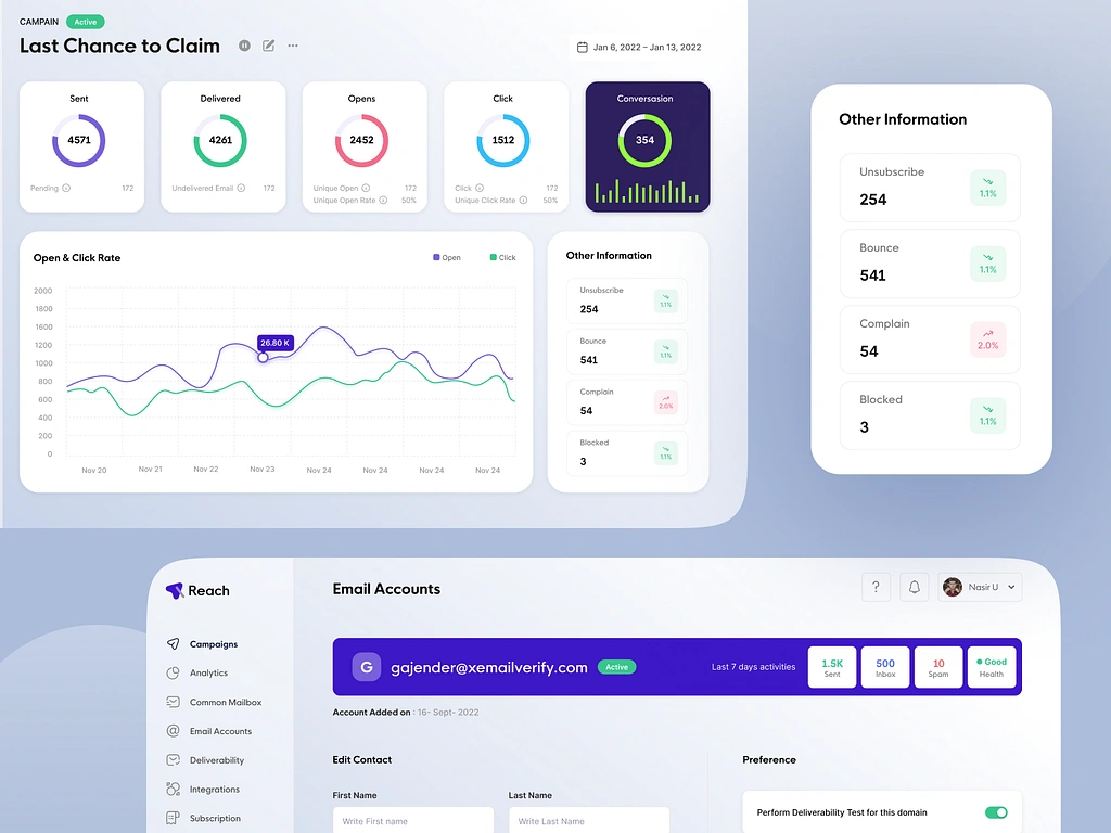
In the ever-evolving landscape of digital design, where every pixel counts and aesthetics play a pivotal role in user engagement, choosing the right color palette can be the secret ingredient that transforms a good interface into a great one. Imagine a world where intuitive design meets vibrant hues, creating not just an interface but an experience that resonates on an emotional level. This is the power of UI Color in SaaS Design. The right blend of shades does more than decorate; it guides, influences decisions, and evokes emotions, turning casual users into loyal enthusiasts. As we dive into the nuances of product design, we’ll explore how mastering the art of color selection can elevate your SaaS platform, setting you apart in a crowded digital marketplace.
As you navigate the complex landscape of product design, consider the psychological impact of every color choice you make. Color isn’t just a visual experience; it’s a form of communication that speaks to the core of our sensory perceptions. From the calming blues that suggest trust and reliability to the energetic reds that capture attention and inspire action, each hue has the potential to tell a story. By understanding the subtle but powerful language of colors, designers can craft interfaces that not only look appealing but also enhance usability and accessibility. Join us on this journey to uncover the science and artistry behind effective UI Color in SaaS Design, and learn how to transform your digital products into masterpieces of both form and function.
The Psychology of Color in UI Design
When it comes to UI design, color is not just about aesthetics; it has a profound psychological impact on users. Different colors evoke different emotions and can influence user behavior. Understanding the psychology of color is crucial for creating an interface that resonates with your target audience.
For example, blue is often associated with trust and reliability, making it a popular choice for financial institutions and healthcare websites. On the other hand, red is known to capture attention and create a sense of urgency, which makes it effective for call-to-action buttons or notifications.
By strategically using colors that align with your brand values and target audience preferences, you can create a user experience that feels intuitive and engaging. The right color palette can help establish trust, evoke positive emotions, and guide users through your interface seamlessly.
Choosing the Right Color Palette for Your SaaS Platform
When designing a SaaS platform, selecting the right color palette is crucial for creating a cohesive and visually appealing interface. Your color choices should reflect your brand identity while also considering the preferences of your target users.
Start by defining your brand’s personality traits and values. Are you aiming for a modern and minimalist look or a bold and vibrant aesthetic? Once you have clarity on your brand identity, you can begin exploring different color combinations that align with those characteristics.
Consider using complementary colors to create visual interest while maintaining harmony within your design. Additionally, pay attention to contrast to ensure readability of text and elements. High contrast between background and text colors improves accessibility for users with visual impairments.
Creating Visual Hierarchy with Color
In UI design, visual hierarchy refers to the arrangement of elements in order of importance. By utilizing color effectively, you can guide users’ attention and create a clear hierarchy of information.
One common technique is to use bold and vibrant colors for primary actions or important elements, while using more subdued colors for secondary or less important elements. This contrast in color helps users quickly identify the most critical information on the screen.
Another way to create visual hierarchy is through color saturation. Using highly saturated colors for important elements and desaturated colors for less important ones can draw attention to specific areas of your interface.
Enhancing User Experience through Color Psychology
Color psychology plays a significant role in user experience. By understanding how different colors evoke specific emotions, you can design interfaces that elicit the desired response from users.
For example, if you want to create a sense of calmness and relaxation, incorporating shades of blue or green can help achieve that effect. On the other hand, if you want to create a sense of urgency or excitement, using warm colors like red or orange can be effective.
It’s essential to consider cultural differences and individual preferences when leveraging color psychology in your design. Conducting user research and testing can provide valuable insights into how different audiences perceive and respond to specific color choices.
Implementing Color Accessibility Standards in Product Design
Inclusive design is crucial in today’s digital landscape. As designers, it’s our responsibility to ensure that our products are accessible to all users, regardless of their abilities.
When it comes to color accessibility, there are several guidelines to follow. One key consideration is providing sufficient contrast between text and background colors. This ensures that users with visual impairments can read content comfortably.
In addition, it’s essential to avoid relying solely on color as the sole means of conveying information. Incorporating other visual cues such as icons or labels helps users with color blindness or other visual impairments understand the interface.
Establishing Brand Identity through Color Consistency
Consistency is key when it comes to establishing a strong brand identity. Using a consistent color palette across your SaaS platform helps users recognize and associate your brand with specific values and emotions.
When choosing your brand colors, consider their versatility across different platforms and devices. Ensure that your colors remain consistent in various lighting conditions and on different screen sizes.
By maintaining color consistency, you create a cohesive user experience that strengthens brand recognition and builds trust with your audience.
Utilizing Color Trends to Stay Relevant in Design
The world of design is constantly evolving, and staying up-to-date with color trends can help keep your SaaS platform relevant and visually appealing.
Research current design trends and explore how they can be incorporated into your color palette. However, it’s important to strike a balance between following trends and maintaining a timeless design. What may be trendy today may quickly become outdated tomorrow.
Consider using color trends as accents or small elements within your design rather than relying on them as the primary colors. This allows for flexibility in updating your design without losing its core identity.
A/B Testing and Optimizing Color Schemes
A/B testing is an invaluable tool for optimizing your UI color schemes. By testing different color variations, you can gather data on user preferences and make informed decisions about which colors work best for your target audience.
Create multiple versions of your interface with different color schemes, then analyze user behavior metrics such as click-through rates or conversion rates to determine which version performs better. This data-driven approach ensures that you’re making design decisions based on actual user preferences rather than personal biases.
Integrating Feedback for Continuous Color Improvement
Feedback from users is essential for continuous improvement in UI color design. Encourage users to provide feedback on their experience with your interface, including their thoughts on the color choices.
Consider implementing feedback mechanisms such as surveys or user testing sessions to gather insights into how users perceive and interact with your color scheme. This feedback can help identify areas for improvement and guide future iterations of your design.
Harnessing the Power of UI Color in SaaS Design
The power of UI color in SaaS design cannot be underestimated. By understanding the psychology of color, choosing the right color palette, and leveraging color trends, you can create a visually appealing and engaging user experience that sets your SaaS platform apart.
Remember to prioritize accessibility by following color contrast guidelines and considering the needs of all users. A/B testing and integrating user feedback will help you optimize your color schemes over time, ensuring that your design continues to evolve and meet the changing needs of your audience.
Add Call to action
Ready to elevate your SaaS platform with the power of UI Color? Start by analyzing your current color palette and considering how it aligns with your brand identity and target audience preferences. Experiment with different colors, test variations through A/B testing, and gather user feedback to continuously improve your design.
Crafting excellence in UI Color is an ongoing process that requires attention to detail, research, and a deep understanding of user psychology. By investing time and effort into mastering this art form, you can create a remarkable user experience that captivates users from their first interaction.
Elevate your SaaS platform’s design today by harnessing the power of UI Color!


