


In the dynamic realm of digital landscapes, first impressions aren’t just vital—they’re often the defining factor in a website’s success. For on-demand services, where the need for speed and efficiency reigns supreme, crafting an intuitive user experience is key. Yet, in a world teeming with endless online choices, how do you ensure that your website not only catches the eye but also keeps users coming back for more? Enter the art and science of the perfect website design guideline, a strategic blueprint poised to transform mere visitors into loyal users. By harnessing cutting-edge trends and essential features, this guide will help you sculpt an on-demand platform that doesn’t just meet expectations but exceeds them at every click.
Imagine navigating a website that anticipates your every move, effortlessly guiding you from curiosity to conversion without a single friction point. Such a seamless journey may seem like a digital utopia, but it’s entirely achievable with the right set of website features. From streamlined navigation that mirrors the logic of your users’ cognitive pathways to visually engaging interfaces that hold attention spans in thrall, the details woven into the framework of your website could be the difference between instant abandonment and prolonged engagement. As we delve deeper, expect to uncover not just a list of must-have elements, but a comprehensive understanding of why each feature matters and how it aligns with contemporary user expectations and business goals. Get ready to transform your online presence, elevating it from functional to phenomenal.
User-Centric Design: Putting Your Audience First
When it comes to website design, putting your audience first is paramount. User-centric design focuses on creating a seamless and intuitive experience for your visitors. By understanding their needs, preferences, and behaviors, you can tailor your website to meet their expectations and provide them with a delightful journey.
One of the key aspects of user-centric design is conducting thorough research on your target audience. This involves gathering data on their demographics, interests, and browsing habits. By gaining insights into who they are and what they want, you can make informed decisions about the layout, content, and functionality of your website.
Another important element of user-centric design is usability testing. This involves observing how users interact with your website and identifying any pain points or areas for improvement. By incorporating feedback from real users, you can refine your design and ensure that it caters to their needs effectively.
In addition to research and testing, user-centric design also emphasizes the importance of clear communication. Your website should have concise and compelling copy that resonates with your target audience. It should also have intuitive navigation that guides users effortlessly through different sections of your site.
By prioritizing user-centric design principles, you can create a website that not only attracts visitors but also keeps them engaged and encourages them to take desired actions.
Responsive Web Design: Ensuring Seamless Experience Across Devices
In today’s digital landscape, people access websites from a variety of devices such as smartphones, tablets, laptops, and desktop computers. To provide a seamless experience for all users regardless of the device they’re using, responsive web design is essential.
Responsive web design involves creating a flexible layout that adapts to different screen sizes and resolutions. This ensures that your website looks great and functions properly on any device, providing a consistent and user-friendly experience.
With responsive web design, elements such as images, text, and navigation menus automatically adjust to fit the screen. This eliminates the need for users to zoom in or scroll horizontally, making it easier for them to navigate and consume your content.
Moreover, responsive web design has become increasingly important for search engine optimization (SEO). Search engines like Google prioritize mobile-friendly websites in their rankings. By implementing responsive design, you can improve your website’s visibility in search results and attract more organic traffic.
By embracing responsive web design, you can ensure that your website delivers a seamless experience across devices, allowing users to engage with your content wherever they are.
Intuitive Navigation: Guiding Users Effortlessly Through Your Site
Intuitive navigation is crucial for keeping users engaged and helping them find what they’re looking for on your website. When visitors arrive at your site, they should be able to navigate through different pages and sections without confusion or frustration.
To achieve intuitive navigation, it’s important to organize your content logically and make it easily accessible. This involves using clear headings, subheadings, and menus that reflect the structure of your website. Users should be able to understand where they are within the site hierarchy at all times.
In addition to clear organization, intuitive navigation also relies on user-friendly features such as search bars and breadcrumbs. A search bar allows users to quickly find specific information or products by typing in keywords. Breadcrumbs provide a trail of links that show users their current location within the site’s structure.
Furthermore, incorporating visual cues such as buttons and icons can enhance the user experience by making it easier for users to interact with your site. For example, a “back” button can help users navigate back to a previous page, while a shopping cart icon can indicate where users can view and manage their purchases.
By prioritizing intuitive navigation, you can guide users effortlessly through your site, ensuring they have a positive experience and find what they’re looking for.
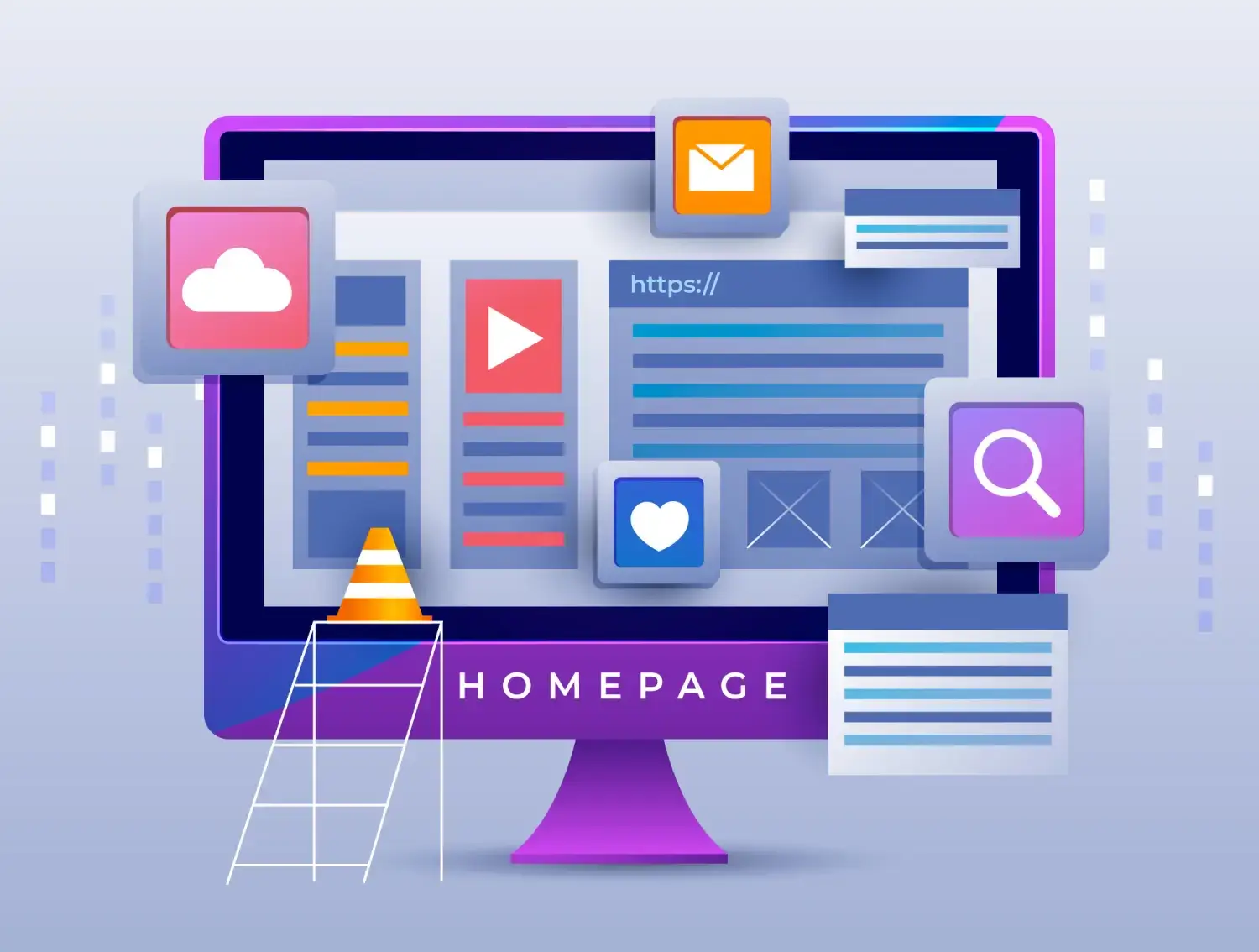
Compelling Visuals: Captivating Users from the First Glance
When it comes to website design, visuals play a crucial role in capturing users’ attention and conveying your brand’s message. Compelling visuals can create an emotional connection with your audience and leave a lasting impression.
One of the key visual elements to consider is the use of high-quality images. Images that are relevant to your content and visually appealing can instantly grab users’ attention and make them want to explore further. Whether it’s product photos, illustrations, or stunning landscapes, choose visuals that align with your brand identity and evoke the desired emotions.
In addition to images, typography also plays a significant role in website design. The fonts you choose should be legible and reflect your brand’s personality. Consider using different font styles for headings, subheadings, and body text to create visual hierarchy and make important information stand out.
Furthermore, incorporating videos into your website can be highly engaging for users. Videos allow you to showcase products or services in action or tell compelling stories that resonate with your audience. Just make sure the videos are optimized for fast loading times to avoid frustrating users.
By leveraging compelling visuals, you can captivate users from the first glance and create a memorable experience that sets your website apart from the competition.
Call-to-Action (CTA) Optimization: Driving Conversions with Precision
A call-to-action (CTA) is a crucial element of any website as it prompts users to take specific actions such as making a purchase, signing up for a newsletter, or contacting your business. Optimizing your CTAs can significantly impact your conversion rates and drive desired user actions.
When designing CTAs, it’s important to make them visually distinct and easy to locate. Use contrasting colors, bold typography, or buttons to make the CTA stand out from the rest of the page. Additionally, consider placing CTAs strategically in areas where users are most likely to engage with them, such as at the end of a blog post or on a product page.
The language used in your CTAs is also crucial. Instead of generic phrases like “Click here” or “Submit,” use action-oriented and persuasive language that clearly communicates the value users will receive by taking the desired action. For example, instead of “Sign up,” you could use “Get exclusive access” or “Join our community.”
Furthermore, optimizing your CTAs involves testing different variations to see which ones perform best. A/B testing allows you to compare different designs, placements, and messaging to determine which combination drives the highest conversion rates.
By optimizing your CTAs with precision, you can drive conversions and encourage users to take meaningful actions on your website.
Loading Speed Optimization: Keeping Users Engaged Instantly
In today’s fast-paced digital world, users have little patience for slow-loading websites. If your site takes too long to load, visitors are likely to abandon it and seek alternatives elsewhere. Therefore, optimizing loading speed is crucial for keeping users engaged and preventing bounce rates from skyrocketing.
There are several strategies you can employ to improve loading speed:
- Optimize image sizes: Compress images without sacrificing quality to reduce file sizes and decrease loading times.
- Clean up code: Minify CSS and JavaScript files to remove unnecessary characters and reduce file sizes.
- Utilize caching: Implement browser caching to store certain elements of your website on users’ devices, allowing for faster subsequent visits.
- Choose a reliable hosting provider: Select a hosting provider that offers fast servers and reliable uptime to ensure your website loads quickly.
In addition to these technical optimizations, consider prioritizing content above the fold. This means that the most important content should load first, allowing users to start engaging with your site while the rest of the page loads in the background.
By optimizing loading speed, you can create a seamless user experience that keeps visitors engaged from the moment they land on your site.
Accessibility Features: Catering to All Users Inclusively
Creating an inclusive website that caters to all users, including those with disabilities or impairments, is not only ethically important but also legally required in many jurisdictions. By implementing accessibility features, you can ensure that everyone can access and navigate your website effectively.
Some key accessibility features to consider include:
- Alternative text for images: Provide descriptive text for images so that visually impaired users can understand their content through screen readers.
- Captions and transcripts for videos: Include captions or transcripts for videos so that users with hearing impairments can access the information presented in them.
- Easily navigable structure: Ensure that your website’s structure is logical and easy to navigate using keyboard controls alone. This is particularly important for users who rely on assistive technologies like screen readers or keyboard navigation.
- Contrasting colors: Use color combinations that provide sufficient contrast between foreground and background elements to accommodate users with visual impairments.
By incorporating these accessibility features, you can make your website more inclusive and ensure that all users can access your content and navigate your site without barriers.
Mobile Optimization: Adapting to the Mobile-First Era
In today’s mobile-first era, optimizing your website for mobile devices is no longer optional—it’s essential. With a significant portion of internet traffic coming from smartphones and tablets, failing to provide a seamless mobile experience can result in lost opportunities and frustrated users.
Mobile optimization involves designing your website specifically for smaller screens, ensuring that it looks and functions flawlessly on mobile devices. This includes using responsive design techniques, optimizing loading speed for mobile networks, and simplifying navigation for touchscreens.
When optimizing for mobile, it’s important to prioritize the most critical information and functionalities. Mobile users are often looking for quick answers or immediate actions, so make sure these are easily accessible on your mobile site.
In addition to responsive design, consider leveraging mobile-specific features such as click-to-call buttons or location-based services. These features can enhance the user experience by providing convenient ways for users to contact or locate your business while on the go.
By adapting to the mobile-first era, you can ensure that your website remains relevant and accessible to a growing number of mobile users.
Security Measures: Building Trust and Confidence
In an age where cyber threats are prevalent, building trust and confidence with your website visitors is crucial. Implementing robust security measures not only protects sensitive user data but also instills confidence in users that their information is safe when interacting with your site.
Some essential security measures include:
- SSL encryption: Secure Sockets Layer (SSL) encryption ensures that data transmitted between your website and users’ browsers is encrypted and cannot be intercepted by malicious actors.
- Regular software updates: Keep your website’s software, plugins, and themes up to date to patch any security vulnerabilities that may be discovered.
- Strong password policies: Enforce strong password requirements for user accounts to prevent unauthorized access.
- Secure payment gateways: If your website involves e-commerce or accepts online payments, ensure that you use secure payment gateways that comply with industry standards.
In addition to these technical measures, displaying trust signals such as security badges or customer testimonials can also help build trust with your users. These signals indicate that your website is trustworthy and takes user security seriously.
By prioritizing security measures, you can build trust and confidence with your users, encouraging them to engage with your site without hesitation.
Conclusion: Crafting a Website That Exceeds Expectations
In conclusion, implementing the essential features outlined in this website design guideline is crucial for creating a platform that not only meets but exceeds user expectations. By adopting a user-centric approach, optimizing loading speed, ensuring intuitive navigation, leveraging compelling visuals, driving conversions with precision CTAs, embracing mobile optimization and accessibility features, and prioritizing security measures, you can craft a website that stands out from the competition and keeps users coming back for more.
A well-designed website not only attracts visitors but also provides them with a seamless experience across devices. It guides them effortlessly through different sections of the site while captivating them with compelling visuals. It drives conversions through strategically placed CTAs and ensures fast loading times to keep users engaged instantly. It caters to all users inclusively by implementing accessibility features and adapts to the mobile-first era with responsive design. Lastly, it builds trust and confidence through robust security measures.
By following this website design guideline and continuously iterating based on user feedback and industry trends, you can create a website that not only meets the needs of your audience but also exceeds their expectations at every click.


